So, as promised, I'm back with my Pull Tab Card Tutorial for this card:
To create your own Pull Tab Card, you will need a card base (I used a standard 4.25" by 5.5" card) and a top layer for the card (I made mine approximately 3.75" x 5"). Then, you can add as many other layers as you would like in between (I happened to have two other layers, one 4" x 5.25" and one approximately 3-7/8" x 5-1/8").
With the top layer of your card, cut two slits in your card stock to create a track for the image you want to pull across your card. I did this using my handy-dandy Fiskars Paper Trimmer. I made my cuts so that they started and ended 1" from the edge of the card stock and were about 5/8" apart. (Wish now that I had taken a photo of this step! Live and learn!) Also, this would be a good time to stamp any images you want on this layer for your card!
For the next step, you need to create the pieces to move across the track. Mine consisted of two Whisper White paper strips. The first was about 1/2" x 2", and I folded that in half, ending up with a 1/2" x 1" piece afterwards. The second strip was an odd shaped strip -- about 1/2" in width and about 4.25" long but with a tab sticking up on one end. Here's where a little visual aid becomes very useful--and I actually do have a photo for this part! This photo shows what my odd shaped strip looks like:

To get to the stage in the photo, I wrapped the first piece (the folded 1/2" x 2" piece), around the track, and glued just the ends of it closed. Next, I attached the odd-shaped piece, gluing the tab part to the first piece.
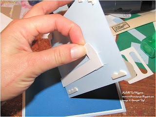
Here's a photo of that:
As you can see in the photos, I attached Stampin' Dimensionals in the corners and also above the sliding mechanism, being careful to position them so they would prevent the white slider mechanism from coming too far out of place, but not anywhere that would prevent it from being able to slide across. In other words, you do not want the dimensional in the middle of the card to catch on the part of the slider that sticks up.
I then attached this layer to the card base. Sorry about the fuzzy photo -- but wanted you to be able to get an idea what this stage looks like!
Finally, created the stamped piece to attach to the front. I used two stacked Stampin' Dimensionals to attach the stamped piece to the slider mechanism.
Actually pretty simple and fun to create -- hope you will try it and let me know how it turns out for you!
- Michelle


2 comments:
Can I say "That's too Cool!" I'm definitely going to do that for my nieces and nephew. They'll love it.
Terrific tutorial, Michelle! I'm gonna have to try this one out. It looks like so much fun!!
Post a Comment