Tuesday, August 31, 2010

Going Confidently in the Direction of Your Dreams -- Decor Elements

Recently, I helped a friend add some Decor Elements to a special area she created for children to play as they wait in her husband's financial planning office.  A big thanks to Debbie and Scott Stauffer for letting me share these photos with you. 

The Decor Elements she chose were perfect for this wonderful area, don't you think? 


I really love how it turned out!  The tree is the Large Thoughts and Prayers Tree in chocolate and the saying and birds are the Large Direction of Your Dreams, also in chocolate. 

There are so many fun ways to use Decor Elements, if you haven't checked out the latest catalog, please be sure to click here and browse it online.  Or leave me a comment that you need a copy, and I'll arrange to get one to you.

Thanks so much for stopping by!
- Michelle

Thursday, August 26, 2010

Sweet Nothings CD Scrapbook Album

Today, I have a different kind of scrapbook to share with you.  This is a scrapbook I created to give as a gift to a friend of ours who recently married.  It had been a while since I had created a CD scrapbook (I first started making these a few years ago after seeing them on the amazing Patty Bennett's blog), but I thought that would be a fun choice, and I had been going through my retired Simply Scrappin' Kits and came across the Sweet Nothings Kit, which seemed perfect for the occasion!  Here's how it turned out
This was great fun to make -- I love how everything in the kits coordinates so well to make fabulous projects even easier!  Of course, I also had fun adding the new Stampin' Up! Basic Pearls all over!!!

Thanks for stopping by!

-- Michelle

Wednesday, August 25, 2010

Disney Autograph Books -- Part 2

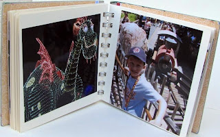
We returned to Disneyland this summer, and again the kids were set with autograph books that we created!  Each boy chose a shape that I could die cut with the Big Shot for his book, and we created each book using On Board Chipboard, Card Stock, and a jump ring.  Here's how the covers turned out:


For the inside photos, since these books were smaller than last year's books, so I had to be a bit creative to get the right sized photos.  I knew I wanted the photos to be 2 x 3" to fit on the pages, so decided to use My Digital Studio to put 2 photos together on a page, which I could then export to the print service and get 2 photos per 4 x 6 printed!   Much more economical than trying to print what I wanted as wallet size photos. 

In My Digital Studio, I started by selecting the option to create a 4.25 x 5.5 card.  Then, I created two equal size photo boxes on each "page" in my project, and inserted the photos I wanted.  On a few of the pages, I added some graphics as well.  Then, when I was finished, I selected the option to save the photos as jpegs, which I then could upload to the print service.  On the print service site, I did have to do a little cropping to make sure that when the photos printed at 4 x 6, I'd have the area that I wanted.  But, that was quick and easy. 

This is what one of my sample jpegs looked like:


Here are some of my favorite pages from inside the book:


(on the inside cover of each book, I added a sticker the boys were given after we completed a survey, and then for the page on the right (I guess you'd call it the inside title page), I created the title box, title and graphics using My Digital Studio punches and Extreme Elements Digital Stamp Set).


The boys love looking through their books and remembering their trips -- and so do I!  Such an easy and  fun way to preserve these memories!

Thanks for stopping by!

-- Michelle

Tuesday, August 24, 2010

Disneyland Autograph Books -- Part 1

Last year, we took a special trip to Disneyland to celebrate my parents' anniversary.  It was my boys' first visit, and we had planned a special celebration dinner at Goofy's Kitchen (one of the character dining experiences), so I knew we'd be seeing lots of characters, and I figured the boys would want to get their autographs.  So, I decided to create autograph books for them out of the Stampin' Up! 5 x 5" Art Journals. 


I adhered Designer Series Paper (that pattern is now retired) to the outside and inside of the covers, added some images and text, then added a window sheet over the cover for additional protection (in retrospect, probably not necessary, as we were pretty good about keeping their books in a plastic bag when not being signed). 

We tried to have the characters only sign one side of the page, and space signatures out, so when we returned home, I was able to add photographs of the boys getting the autographs and of other special memories from our trip.  Here are some of the inside pages:


We didn't have quite as much advance time for our trip this year (I think we only decided to go about a week or two in advance), so I ended up creating a different style of book for the boys with materials I had on hand.  Will show you those in the next post! 

Thanks for stopping by!

-- Michelle

Friday, August 20, 2010

Each Peach, Pear . . . Concord!

For hostess club this month, I wanted to show off some of the newest In Colors, so checked out my handy dandy new Color Coach, and really liked the Concord Crush Creative Combination, which is Concord Crush, Pear Pizzazz, and Peach Parfait.  Sounds pretty yummy, right?  Wait until you see how it looks together!

Here's the card I created with these colors:


I sponged the In Colors onto Presto Patterns Designer Series Paper.  The owl stamp is from the Cute by the Inch Level 2 Hostess set, and was stamped in Concord Crush onto Whisper White.  I used my Blender Pen and some ink from the lid of my Peach Parfait stamp pad to color in the owl's beak and feet.  Then, added some Moonlight Smooch (can you tell I'm absolutely addicted to using this on my projects?).  Here's a closer view of the owl so you can see the Smooch a bit better (the sparkle is much more impressive in real life -- haven't figured out quite how to capture that with the camera yet!):


 I cut out the image and then layered it onto the piece of Concord Crush, which I had punched out with the Scallop Square Punch. 

Layered the Presto Patterns piece onto a piece of Pear Pizzazz card stock, which I had punched with the Scallop Trim Border Punch, and then layered those onto a Sahara Sand card base.  Finished the card off with some Whisper White Organza Ribbon and some rhinestone jewels.

Pretty simple to make, yet pretty elegant!

Thanks for visiting!

- Michelle

Thursday, August 19, 2010

Happy First Day of School!

Daniel went back to school today -- can't believe he's already a second grader!  I tucked a special note and treat in his lunchbox today so he'll know I'm thinking of him and missing him.  We actually made these matchbook treats at my hostess club this past Sunday, along with another card, which I'll show you tomorrow.  (Had meant to show you the autograph books I made for our recent Disney trip, but wasn't able to post earlier this week, so will have to wait til probably this weekend or sometime next week for those.)

Anyway, here's the matchbook treatholder:


This treatholder is somewhat larger than the tea holder I showed last week.  For this one, I started with a 3.25" x 7" piece of card stock, then scored at 2.75", 3", and 6.25"  The shortest end of the matchbook is punched with the Scallop Trim Border Punch.

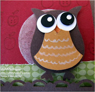
The owl was created with the fun new Two-Step Owl Punch -- the body is Chocolate Chip, his beak is Pumpkin Pie, eyes are Whisper White and Basic Black, and his tummy is made from More Mustard.  I added some Moonlight Smooch Spritz on his eyes and to make the squiggles on his tummy.  Here's a close up of this cute little guy:


The moon behind the owl was created by sponging Frost White Shimmer Paint onto the Cherry Cobbler cardstock, using a 1-1/4" Circle mask.  At hostess club, we found out that it was very important not to have too much Shimmer Paint on the dauber when doing this, or the shimmer paint might leak under the mask! Not so good for achieving the desired effect!

The apples on the Cherry Cobbler card stock piece are from the First Day set in the Summer Mini (only available until the end of this month!)

The designer paper strips on the matchbook are from the Play Date Designer Series Paper (so much fun!!!) 

The "happy" stamp is from the new set Fabulous Phrases, and was punched out using the Jewelry Tag punch.  The cute flower button is from the Brights Designer Buttons, and has a piece of linen thread through it. 

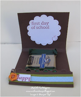
Here's what's inside the matchbook:


The Whisper White scallop circle was created using the new 2-3/8" Scallop Circle Punch.  The images on it are from the First Day stamp set, and are stamped using Cherry Cobbler classic ink.  Then, the finishing touch was adding some doodles with the Moonlight Smooch in each of the scallops. 

I actually ended up having to switch out the chocolate for a lollipop for Daniel because he's decided lately that he doesn't like dark chocolate (gasp!) 

Hopefully he likes his little treat, and hopefully you enjoyed seeing it, too, and will be inspired to create something special for someone you know who is heading back to school!

Thanks for stopping by!

-- Michelle

Thursday, August 12, 2010

Marlene's Textured Thanks Card

Here's another of the cards I received from my friend Marlene Caravello in our recent swap:

I love this one, too!  I think it is so fun how Marlene ran the Greenhouse Gala Designer Paper through the Square Lattice Embossing Folder with her Big Shot.  Looks like she sanded it a little afterwards, too.  And, the ribbon treatment across the card is so pretty, too!!! The stamped image is heat embossed and just sparkles.  That image is from the new Perfect Punches stamp set.  All the images in that set match up with Stampin' Up!'s awesome punches.  Great fun! 

And, again, I have to show you the inside of the card, too!


The designer paper at the top is another design from the Greenhouse Gala pack.  The flower images are from the Watercolor Trio stamp set in the Summer Mini Catalog (only a couple weeks left to order from that!)  The greeting is from the FYI stamp set in the Idea Book.  And, I love the little butterfly die cut -- that's made with the Beautiful Wings Embosslit.

Thanks, Marlene, for letting me share another of your beautiful cards! 

And, thank you for stopping by!!

-- Michelle

Wednesday, August 11, 2010

Marlene's Sew Glad We're Friends Card

I recently swapped again with my talented friend Marlene, and I've already shared the cards I made on her, but have a special treat for you today -- here's the first of the cards Marlene sent me:

Isn't this beautiful?!   Marlene heat embossed the sewing machine image and greeting, which is from the Puns from the Past set.  The background paper is from the Newsprint Designer Series Paper Pack, and the ribbon is the Basic Black 1-1/4" Striped Grosgrain Ribbon.  There's actually a small strip of black card stock through the button holes -- really looks like thread!  And, there's wonderful texture on the Basic Black Card Stock behind the ribbon and the Real Red Circle behind the focal image.  Marlene used the Big Shot to emboss these with the Square Lattice Embossing Folder -- a must have!

Marlene always does a wonderful job of finishing the inside of her cards as well, so I would be remiss if I didn't show that off!  Here it is:


The lined paper is from the Newsprint pack, the greeting is from the Full of Life stamp set, and the border is created with the Pinking Hearts Border Punch.

Be sure to stop by again tomorrow -- I have another one of Marlene's beautiful creations to share with you!

- Michelle

Tuesday, August 10, 2010

"Tea"-riffic Matchbook Thank Yous Tutorial

As a little thank you treat for my hostess club members last month, I prepared some special matchbook treats. 

I started with a 2" x 5.5" piece of Sahara Sand card stock, and scored it at .5", 3", and 3.25". 


Then, I stamped the cover, using Versamark and a stamp from the Noteworthy set.  My apologies for the poor photo, but if you squint, you can just barely see the subtle flourishes in the photo below:


Next, I inserted the tea bag (which I had to fold a little to fit), folded the half inch flap on the cover up over the tea bag, and stapled it into the matchbook.


All that was left then was to decorate the cover.  I stamped images from Noteworthy and Tea Time to create the Oval piece to attach to the front cover, and added some sparkle to the images with Moonlight Smooch.  You can see some of the sparkle in this image: 


I added a piece of Pretty in Pink 1/8" Taffeta Ribbon to dress the matchbook up a bit more! 

And, last but not least, I added a message on the inside.  I love how you can attach two of the clear mount stamps to a block and line them up just the way you want them!

These stamps are from the Level 1 Hostess Set Just Because!

We have hostess club coming up again this Sunday, and we'll be making another, larger version of the matchbook there.   Stay tuned, I'll show you that project sometime next week!  In the meantime, I have some beautiful cards from Marlene to show you in the next couple days, plus will show you some special books I created for my boys to collect autographs at Disneyland!

Thanks for stopping by!

- Michelle

Sunday, August 8, 2010

Sneakin' In a Play Date with Mojo Monday!

I couldn't resist making a card with this week's Mojo Monday Sketch (# 150)!  Here's what I came up with:


I used the fun new Play Date Designer Series Paper on this card, along with the new Two-Step Owl Punch.  The flowers are from the Punch Potpourri Level 1 Hostess Set, and were stamped in Early Espresso, then punched out with the Boho Blossoms Punch, sponged with So Saffron, and topped with a pearl! 

The greeting is from the new Fabulous Phrases set, and was stamped in Chocolate Chip on Whisper White, then punched out with the Word Window Punch.  I layered that onto a piece of Old Olive punched with the Modern Label Punch, and sponged with Chocolate Chip Classic Ink.

The Tempting Turquoise card stock behind the owl was double embossed with the Square Lattice and Elegant Lines Embossing Folders, then sponged with Chocolate Chip Classic Ink. 

The red ribbon strip in the center was created from a piece of Real Red, embossed with the Square Lattice Embossing Folder, then layered with a piece of Real Red 1/8" Taffeta Ribbon and a couple more pearls.  Here's a closer photo:


Thanks for stopping by!

- Michelle

Saturday, August 7, 2010

Just Because Swap Card

I've been keeping you, my faithful readers, in suspense far too long!  Almost a month ago, I told you I had created a card with the new Level 1 Hostess Set Just Because for a couple of swaps with fellow demonstrators (with my friend Marlene and the Convention Pity Party Swap for Late Night Stampers' demonstrators not able to attend Convention this year but who didn't want to miss out entirely on the fun of swapping cards and ideas).  Well, those swaps are all complete now, so I can finally reveal the whole card!  Here it is:


The hydrangea images and greeting were heat embossed with Versamark and Black Embossing Powder on Glossy White, and then I watercolored using Aquapainters and Regal Rose, Sahara Sand, and Tempting Turquoise Classic Ink Refills.  The Regal Rose layer was partially embossed using the Vintage Wallpaper Embossing Folder.  I sponged Crumb Cake Classic Ink around the Sahara Sand layers and card base.  Then, I finished off the card using looped Whisper White Organza Ribbon and one of the small pearls from Stampin' Up!'s new Basic Pearls Jewels (I'm so glad we have these now!  Such a great deal, too -- 150 pearls for only about $5!)

Hope you are having a great weekend!  Thanks for stopping by!

- Michelle

Wednesday, August 4, 2010

Too Many Punches!?!

My apologies -- feel like I've been very quiet since returning from vacation last week.  Somehow I was able to get posts set up ahead of time for the days we were away, but since we've been back it's been hard to sit down and write a post!  Especially frustrating since I have plenty of fun stuff I'd like to share!!

Anyway, first wanted to share that while I really enjoy using punches in my paper crafting (you might have noticed!), I am afraid that recent events have forced me to admit that I have a problem.  I'm addicted to punches and my supply has apparently runneth over! 

We'd just returned from our vacation, when something . . . well, let's say not entirely unexpected . . . happened.    My punch organizer and all of its contents came crashing down!!!   Very dramatic.  Fortunately noone was under it when it happened! 

I'd noticed a couple weeks back that the top was starting to break away, but had hoped that it would hold together for at least a little longer.  Alas, that wasn't to be . . . instead here's what happened:


Aaaahhhh!!!!  Punches everywhere!!!

I'm happy to report, though, that I have already purchased a replacement and reorganized my punches (leaving my older, retired punches out to hopefully extend the life of this organizer!  So far, so good.)


Order restored!  Whew! 
- Michelle