Wednesday, April 28, 2010

Timothy's Mother's Day Tea Invitation

The preschool that my oldest attended and that my little guy, Timothy, is currently attending has the most wonderful Mother's Day tea -- the children sing some songs and then there are wonderful desserts prepared by the lead teacher, and it is a wonderful time for everyone there to relax, chat, and enjoy.  Each year for the past several years, I have been honored to have been asked by the teacher to design a card for the kids to create to invite their moms and grandmas to the tea.  I think all of the invitations have gone out now, so I can show you what I designed.

I've been playing a lot lately with Fifth Avenue Floral, and decided that would be a wonderful set to use.  So, I heat embossed images on watercolor paper, which the children could then paint for their moms.  I've seen this technique done beautifully many times, but I believe the first place I saw it was on the incredibly talented Patty Bennett's blog -- you can see her excellent tutorial for this technique in this post.

Here is Timothy's painting on a finished invitation:


The images were watercolored using Pixie Pink, Marvelous Magenta (a color that retired sometime around 2005 or 2006), YoYo Yellow, and Green Galore ink refills.  I really love how the colors blended when Timothy painted -- he sends the colors all over in a much more relaxed and fluid way than I would do.  I really like the result, and think I have much to learn from his style!  In fact, I was able to observe some of Timothy's class mates doing their paintings, and it was very fun to see their different approaches to using the colors.  Some brushed on the color with wild abandon like Timothy, while others were much more cautious and intentional about where they put the brush.  Regardless, their work all turned out beautifully.

The focal images were mounted on Regal Rose Card Stock, and then I pulled out some Pink Pirouette Textured Card Stock for the larger layer (very excited that this past In Color is returning to be part of the new Subtles Color Collection!)  I printed the invitation details on the inside of the Whisper White card stock base, then used the Made with Love stamp from the Art by Design set on the back of the card.

Thanks for stopping by!
Michelle

Monday, April 26, 2010

Sunshine!

      We've been having a rather rainy spring here in the Bay Area, but really enjoyed the sunshine this weekend.  And, I had a special treat late last week when my sweet, talented friend Robin Merriman sent some sunshine my way with a blog Sunshine Award!!!  Thank you so much, Robin! 


This award had some rules attached:

1) Put the award on your Blog

2) Pass the award on to other bloggers who bring sunshine into your life

3) Link the Nominees in your post

4) Let them know you nominated them by leaving a comment on their blog

5) Share the love and link to the person who gave you the award


Here is my Sunshine list -- you'll want to check out the wonderful projects on their blogs:

Erin Blair
Irina Blount
Jan Hoyt
Jana Weaver
Jane Matsumoto
Laura Pinto-Nguyen
Lea Siahaan
Rachel Stelzer
Sherry Dobreski

plus, my friend Marlene Caravello, who doesn't have a blog yet, but should!

- Michelle

Friday, April 23, 2010

Two Steppin' with Fifth Avenue Floral -- Part 2

Here's the second of the two cards I created using Fifth Avenue Floral (20% off this month as part of the Stampin' Up! Two Step into Spring promotion!!) and watercoloring with markers.  Again, I stamped the images with Black Stazon Ink on Watercolor Paper.  However, this time, I used a somewhat different color scheme and layout for more of a clean and simple card:


This time, I used the Real Red Stampin' Write marker to color the rose, and Only Orange for the petals and Yoyo Yellow for the centers of the other flowers.  The background is again Glorious Green and Green Galore.  And, I liked how the focal piece looked with a Glorious Green mat again.

The card base this time is Night of Navy.  I really like how classy and elegant this looks -- still feminine enough with the flowers, but a different feel than with the pink and purple flowers.

After I assembled the card, I could not resist pulling out the Smooch Spritz again -- this time the Silver Foil, which shows up very nicely on the dark background.  

Next time, I have one more card to show you with the Fifth Avenue Floral set, but this time using a different watercoloring technique!

Thanks for stopping by!

- Michelle

Thursday, April 22, 2010

Two Steppin' into Spring with Fifth Avenue Floral -- Part 1

I've been having fun trying some different techniques with the beautiful Fifth Avenue Floral stamp set -- one of my favorites -- I love not only the flower images, but also the amazing versatility with this set!  And, until April 30th, it is part of Stampin' Up!'s Two-Step into Spring promotion, which means you can buy your own set for 20% off!!!

The challenge over at Late Night Stampers this week is to create a Mother's Day card, and Fifth Avenue Floral is a perfect set for that, so here's one of the cards I created:


The focal piece was created by stamping the images with Black Staz-On onto Watercolor Paper.  I then colored with Bold Bright Stampin' Write markers around the lines, and used my Aquapainter to watercolor with the ink left behind by the marker.  For this piece, I used Pixie Pink on the rose, Yoyo Yellow and Only Orange in the centers of the other flowers, and Only Orchid and Lovely Lilac around the edges of the petals.  The leafy background was created with ink from Glorious Green and Green Galore Stampin' Write markers.  I spritzed the whole piece with Vanilla Smooch Spritz (yes, it's official, I am completely addicted to using this on my projects already!!!)

I layered the focal piece onto Glorious Green card stock, and then created a background using Only Orchid.  I ran a strip of the Only Orchid through the Big Shot in the Perfect Polka Dots Embossing Folder, and another strip through the Crimper.  I then spritzed those two pieces with Vanilla Smooch Spritz as well. 

I added two half pearls from the Pretties Kit, and the greeting is from Teeny Tiny Wishes, stamped in Basic Black Classic Ink on Very Vanilla paper.  I punched the greeting out with the Word Window Punch, and layered it onto a piece of Glorious Green that I punched out with the Modern Label Punch. 

In real life, the shimmer is so elegant -- here's a close up to try to show it off a little better:


Hope you'll stop by again tomorrow, when I have another card to show you using the same stamp set and technique, but completely different color scheme and layout! 

And, if you'd like to order your own Fifth Avenue Floral set, please be sure to head over to my online store!

- Michelle

Tuesday, April 20, 2010

Butterfly Smooches

This Sunday afternoon, I finally finished a card that had been in the works for more than a week.  I had some scraps leftover from my Shades of Spring paper that I was itching to use in a card, and a vague idea of how I wanted the layout to look -- just didn't have the time to work on it until my hubby and the boys went hiking and left me behind (I'm recovering from a cold, so wasn't quite up for hiking in the mountains!)  Then, it actually came together pretty quickly.  Here it is:


For the card, I used Regal Rose card stock, then layered on a piece of Pretty Pink card stock, and attached the designer paper strips to that.  Here's a close up of the designer paper strips (so pretty, just couldn't bear to toss them in the recycle bin!):


The little designer paper circles at the side were punched out using the circle from the Itty Bitty Shapes Punch Pack.  I used rhinestones from the Eggscellent Eggs kit to add some bling there, and also on the butterfly. 

The butterfly is cut from wool felt using the Big Shot Stampin' Up! Beautiful Butterflies die.  I used two pieces from that -- the smaller one I stamped with the outline flower from A Beautiful Thing stamp set in Regal Rose Classic Ink.  (Yes, you can stamp on felt!  And, it actually would have been a pretty clear stamped image if I hadn't done what I did next . . . or had waited and stamped after that step!)  Then, I spritzed the butterfly first with Gold Glow Smooch Spritz (TM), and then with the Vanilla Shimmer Smooch Spritz.  The Smooch Spritz is very fun stuff . . . will be available for purchase with the new Summer Mini Catalog, starting May 1st!

Here's a close up of the butterfly:


and another angle:


Hard to capture the subtle shimmer on the felt from the Smooch Spritz, but hopefully you get the idea! 

The butterfly is on a So Saffron circle, cut out using the Circle Scissors Plus, and I also Smooch Spritz-ed that piece.  Here's a close up so you can see a little bit of the sparkle on that:


Love the happy, spring feel of this card . . . hope you do, too!

- Michelle

Friday, April 16, 2010

Razzleberry Vogue Birthday Wishes

Today's card is a special one I made for my wonderful friend Jana's birthday yesterday!  (For those who don't already know, Jana is who helped me get started with Stampin' Up! more than five years ago -- she was my demonstrator before I became one -- and continues to be a mentor and source of inspiration!)

For this card, I used the Very Vintage wheel with Rich Razzleberry ink on Rich Razzleberry card stock.  The flowers from Vintage Vogue were also stamped in Rich Razzleberry, and I added a touch of Only Orange in the center, then blended with an Aquapainter and added some Crystal Effects just in the center.  The ribbon is Pretty in Pink 5/8" Satin Ribbon -- I dyed it Rich Razzleberry by running it across the ink pad and sponging a bit to make the color more even.   The greeting is from the Well Scripted stamp set (in the Occasions Mini . . . only two weeks left to order from that!)  I punched out the greeting with the Large Oval Punch, sponged the edges, and then layered that onto another Very Vanilla piece, punched out with the Scallop Oval Punch.  I love how those two punches work together! 

A little hard to see from the photo but there is actually a layer of Very Vanilla underneath the Rich Razzleberry layer, and on top of the Very Vanilla base.  I really like the look of tone on tone layering.  Have been seeing a good bit of it lately from other cardmakers, too. 

Thanks for stopping by!

- Michelle

P.S.  Did you notice my new blog header . . . made with the digital version of Vintage Vogue and some other new digital downloads!

Wednesday, April 14, 2010

You're a Blast! Birthday Card

Today's card is one that I made for a friend's birthday party recently -- I've been having fun with watercoloring lately, and wanted to use my Storybook Specialty Designer Series Paper to make this card.  I love the fun colors and prints!  Here's what I came up with:


The layout for this card came from Splitcoaststampers Sketch Challenge SC275.  Since the card is red, white, and blue-ish, it also sort of fits this week's challenge over at Late Night Stampers, which is to create a card using your country's colors.

The Ruby Red striped paper on the card is actually from the Patterns Pack III rather than the Storybook Specialty Paper.  The rocket (from the Pun Fun stamp set) was stamped in Basic Black and colored with Watercolor Wonder Crayons and an Aquapainter.  I masked the rocket and spritzed that piece plus the Ruby Red star with Gold Glow Smooch Spritz (TM). . . a sneak peek item from the Summer Mini catalog.  It will be available for purchase May 1st! 

The greeting was made by punching a piece of designer series paper using the Modern Label punch, and  layering on the stamped greeting piece, which had been punched out using the Word Window punch.  I really love using this combination of punches to create greetings -- perhaps you've noticed?!

I made another version of the card using the Ruby Red stripe design from the Storybook Specialty Designer Series Paper.  Here's how that turned out:


Thanks for stopping by!

- Michelle VanWiggeren

Saturday, April 10, 2010

Bring on Spring, Baby, Challenge Card! (and Summer Mini sneak peek)

The card I have to show you today actually meets at least three stamping challenges -- first, I wanted to create a special baby card for a good friend who just had a baby; second, I liked the sketch challenge from Late Night Stampers this week so used that; and finally, it meets the brand new I Dream of Stamping challenge!

The I Dream of Stamping Challenge is up (or will be later this weekend), and this time the challenge is to do a little spring cleaning -- dust off that set you absolutely had to have when you saw it, but that's been waiting to be used ever since!!!   We would love to have you play along . . . be sure to link up your creation over on the I Dream of Stamping blog, and you'll be eligible to win the fabulous Picture This hostess stamp set from the Occasions Mini!!! 

So, without further ado, here is my creation:


The stamped image is from the Love Bug stamp set (a Level One Hostess set in the Idea Book and Catalog) -- I loved this one, and just had to have it as soon as I could after it was available.  However, I'd never used this image and have only made maybe one other card with the set.  Otherwise, it's been sitting neglected on my shelf.  So, it was definitely time to pull it out and give it some love!

I stamped the image on Stampin' Up!'s watercolor paper, and colored using markers and and Aquapainter.  I punched the image out with the 1 3/8" Circle Punch, layered onto a circle of Brilliant Blue punched out with the 1 3/4" Circle Punch, and then layered that onto a Bashful Blue flower from the Die Cut Blooms  package. 

The textured Whisper White piece was created by running the card stock through the Big Shot with my brand new Stampin' Up! Square Lattice Textured Impressions Embossing Folder!  So much fun -- leaves each side of the paper with a different, cool look to it!  The folder is from the Summer Mini and will be available for order May 1!   The Summer Minis were just mailed yesterday from Stampin' Up!, so watch for yours coming in the mail hopefully this week -- if you don't get one this week, please let me know, and I'd be glad to get a copy to you!

The little Bashful Blue and Brilliant Blue flowers are also created with sneak peek items from the Summer Mini -- the Itty Bitty Bits stamp set and the Itty Bitty Shapes punch pack.  Aren't they fun?!  (Interested in getting your own sneak peek products from the Summer Mini?  Ask me about becoming a demonstrator!)

The little banner and the layer of paper behind the textured piece are Green Galore.  Trying to get good use out of my Green Galore, Brilliant Blue, and other retiring colors before they are gone for good on July 1st!

Hope my friend will like this -- and hope you do, too!  Thanks for stopping by!  Now go dust off your own neglected set. and then be sure to stop by I Dream of Stamping and show us what you've created!

- Michelle

Friday, April 9, 2010

Color Renovation

Stampin' Up! made a big, exciting announcement this week -- there's a major Color Renovation coming!!!  When the 2010-2011 Idea Book and Catalog becomes available for ordering on July 1st, we'll have four fabulous new Color Collections -- featuring some returning favorites from the current color families, some of the best In Colors from the past few years (hurrah!!!), and some awesome new colors!  Here's a preview of the new collections:


Click here to see a larger version of the new color chart.  I really like how they have reorganized everything and am very excited to get my hands on the new colors!  Stampin' Up! is sending demonstrators sample card stock in the newest colors with our copy of Stampin' Success (one of the great perks of being a demonstrator!) this month.  You can bet I'll make some cards with those samples and post them here for you to see!  Stay tuned!!!
A number of the current colors will retire, so be sure to stock up on your favorites before July 1st!  We'll be bidding a fond farewell to the following colors:

Pink Passion
Pixie Pink
Pale Plum
Orchid Opulence
Lovely Lilac
Lavendar Lace
Almost Amethyst
Bordering Blue
Brocade Blue
Ballet Blue
Brilliant Blue
Taken with Teal
Glorious Green
Handsome Hunter
Sage Shadow
Mellow Moss
Green Galore
Gable Green
Barely Banana
Yoyo Yellow
Summer Sun
Apricot Appeal
Only Orange
Really Rust
Ruby Red
Cameo Coral
Blush Blossom
Creamy Caramel
Close to Cocoa
Going Gray

If you would like to order ink pads, ink refills, card stock or other items in these colors before they retire, be sure to visit my online store (click the shop now button on my home page to enter the store)!   Please let me know if you have any questions!

- Michelle

Wednesday, April 7, 2010

100th Post! My Paper Rose Shortcut Tutorial

Wow!  Can't believe it, but I'm already to my 100th blog post!  To celebrate, I have a very special tutorial for you . . . for how I've been making paper roses lately.  You might remember I fell in love with the paper roses I first saw created by Julie Williams, and I then went on to create my Flowers for Mom card.  Well, I've come up with a shortcut for putting these beauties together.  Because my creative time is limited (and interrupted early and often) by my wonderful little guys, I like to be able to put things together quickly -- without having to wait for glue to dry, if possible!  So, I decided there had to be a way to make the roses with glue dots.  Guess what?  There is!  And, now I'm going to share it with you . . .

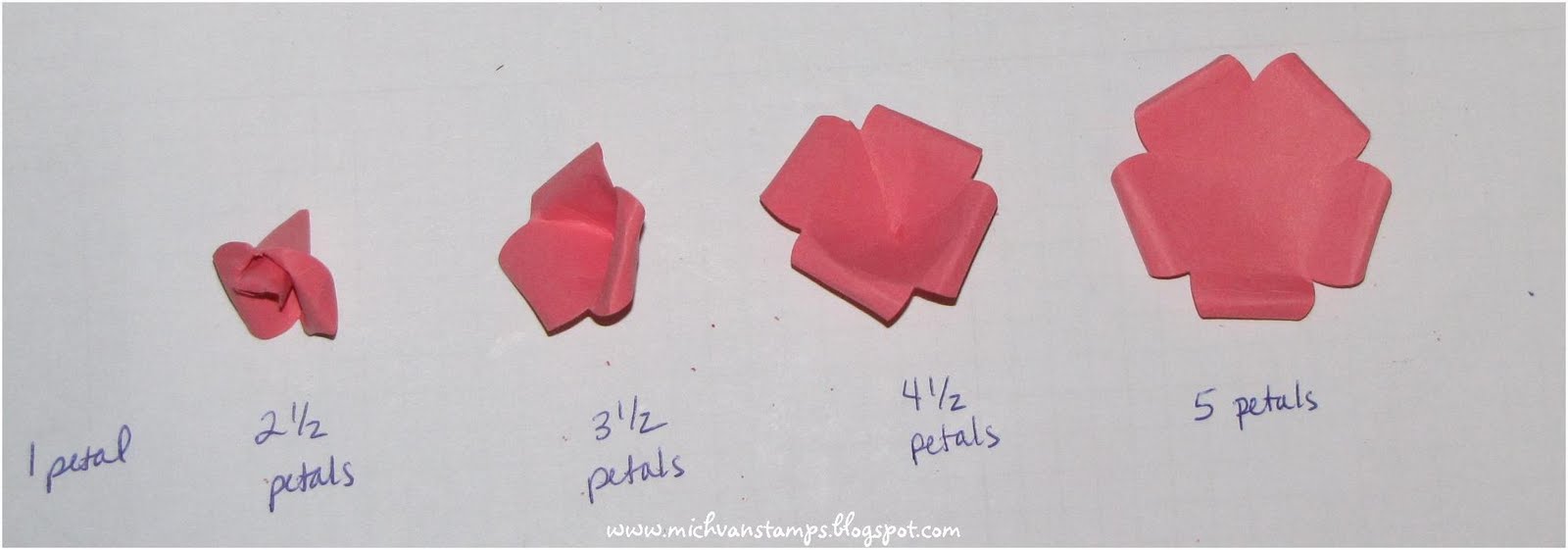
Start by punching four flowers from card stock or designer series paper -- for these, I used the Five Petal Punch:


Then, cut off petals from three of the flowers, so you are left with a 5 petal flower, a 4-1/2 petal flower, a 3-1/2 petal flower, a 2 1/2 petal flower, and a single petal.  Here's a visual:


Next, put a glue dot onto the 1/2 petal "tab" on the 4-1/2 petal flower, and bring the tab behind the petal across the gap from it, hiding the tab on what would be the outside of the flower. 

Then, curl the flower petals.  These petals were curled under several times -- the amount of curling you do, will depend on how tight you want your fiinished rose to look.  You can use a paper piercer to wrap the paper around and create the curl, or perhaps safer would be the technique I've seen my friend Jane Matsumoto use -- pull the paper across your closed scissors almost as you would if you were curling ribbon.  (Maybe Jane will make a tutorial to show her excellent technique for this, if she hasn't already?  Hint, hint.)  For these flowers, I started the process with the scissors, but then ended up rolling them more by hand, to get the curl pretty tight.  The curl of the petals is something that can be adjusted a bit further once the rose is completely assembled as well . . . just easiest to get a good start on it at this stage.

Repeat these steps with the 3-1/2 and 2 1/2 petal flowers, and roll up your single petal, so you end up with this:


Now, it is time to assemble the flower!  (You could also sponge some color around the edges of the pieces at this stage, to add some extra 3D oomph). 

The last time I showed this assembly step, I was asked if it was better to assemble from top to bottom or bottom to top -- I had been doing bottom to top, but that got me thinking, why not try the other way.  Well, turns out top to bottom does work better for me (thanks to Sparrow for making me test this!)  So, put a glue dot on either side of the bottom of the single petal roll, and carefully insert that into the center of the 2-1/2 petal piece so you end up with this:


This would make a cute little but.  But, for a larger flower, again, use two glue dots on either side of the outside of this new piece, and insert into the 3-1/2 petal piece.  The end result should look something like this:

Again, you could stop here, or if you want a larger rose, use two glue dots on the outside to adhere this piece to the 4-1/2 petal piece, like so:


And, finally, adhere this piece to the 5 petal piece, either one or two glue dots will work fine at this stage.  Here's the finished product:


You can do this same process using other punches -- such as the Extra Large Flower Punch.  Here are some photos of the process with that.  First, how to cut the four punched pieces:


Second, how each piece looks after its petals are connected by a glue dot, and petals curled.  Well, and actually in this photo, the assembly process is already underway:


Here are the two glue dots on the outside of the 3-1/2 petal piece as it is about to go to the 4-1/2 petal piece:


And, the finished product:


And, a side view:


Finally, for sake of comparison, here are four roses I've created.  The top two were made using the Extra Large Flower Punch, and with the leaves just slightly curled. 


The bottom left rose is the one created in the photos above using the Extra Large Flower Punch, and the bottom right is the one created in the photos above using the Five Petal Flower Punch.

Hope you enjoyed the tutorial!  Look forward to seeing what you create with it!

- Michelle

Saturday, April 3, 2010

Happy Easter!

Happy Easter to you!  Hope you are having a beautiful weekend!

My family and I are having a good one so far -- despite some colder than usual California weather!  We have been creating some fun Easter projects we wanted to share with you.  Yesterday, my 4 year old handed out special treats at preschool.  Here he is helping me assemble them the night before:


and here's the finished product:


We used the Mini Milk Carton Die in the Big Shot to cut the boxes, then decorated with a strip of paper from the Welcome Neighbor Designer Series Paper (from Sale-a-Bration) and a stamped bunny from the Eggcoutrements stamp set (from the Occasions Mini). 

Later, yesterday afternoon, we had an Easter egg hunt with a group of friends, and I brought along a quick craft project for the kids to make.  We actually have a bit of a tradition in the group of having the children make a tag for their Easter basket as the pre-hunt craft, and that continued this year. 

For this year's tag, I punched out "eggs" from designer series paper using the Wide Oval Punch.  Then, the kids were able to decorate the eggs with other pieces I had pre-punched, including a chick, branch and flowers.  The chick was made using the Extra Large Two-Step Bird Punch from the Occasions Mini.  I punched a bird out of So Saffron, then stuck just the tail part back into the Bird Punch to trim it down to look like a chick.  Got the idea for that from this amazing card and tutorial by Ann Fitzgerald.   The flowers were cut using the Three Flower Punch, and had the centers stamped with images from the A Beautiful Thing stamp set.

Here's my sample:


(Thanks to my husband for taking this picture and the next one, using our new camera that just arrived yesterday!  Our old one was having some pretty serious lens errors and was only working sporadically -- very frustrating when trying to capture special memories this past week -- including my first grader's class' performance of Peter Rabbit!  Anyway, very thankful that we have a reliable camera again!) 

And, here are the tags on my boys' baskets.  You can also see some of the tags we created in years past still attached (a punch art bunny from last year, and a thumbprint bunny from 2008 with the Scallop Circle Punch, I think pretty soon after it was released).


Thanks for stopping by! 

- Michelle

Thursday, April 1, 2010

Easter Scallop Envelope Die Baskets

A couple weeks back, I was very excited to see my amazingly talented friend Jane Matsumoto as the tutorial author on Splitcoaststampers, with a tutorial for her Scallop Envelope Die Baskets, just in time for Easter.  I finally had the opportunity to put together a couple of these adorable baskets this week!   I used the Shades of Spring Designer Series Paper to create mine.  And, kept them pretty simple, with just some of the beautiful 5/8" Satin Ribbon to dress them up.   Here are the photos:


Same basket, inside:


And, the other basket, also created with a sheet from the Shades of Spring Designer Series Paper:


Aren't these fun -- I think they're great not only for Easter, but could be filled with goodies, small gifts or maybe even flowers for other spring occasions, too!  Thanks so much, Jane, for the great tutorial for making these!!!

- Michelle